top of page

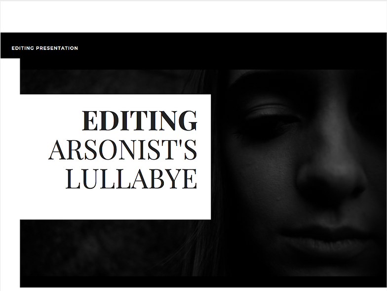
EDITING
EDITING //
Click image below for Canva presentation, exploring the editing process of post-production.
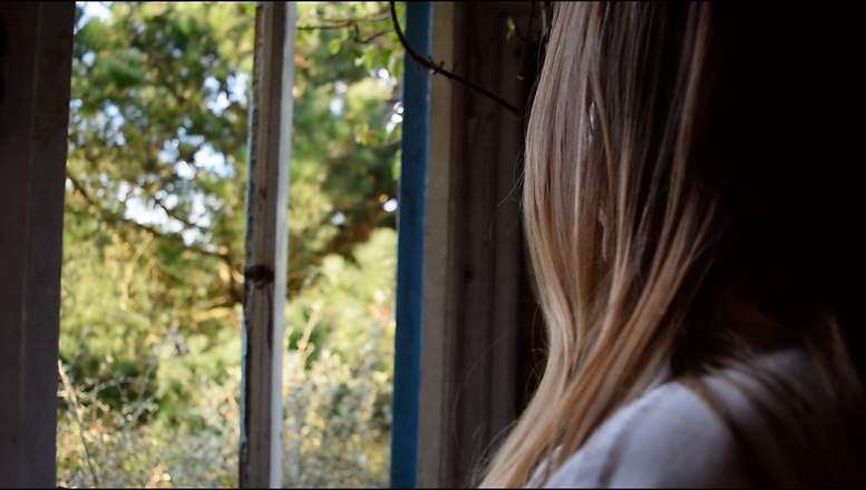
Here is a gallery consisting of the original footage taken for Arsonist's Lullabye before the editing of black and white was overlaid.
EDITING THE ANCILLARY PRODUCTS //
DIGIPAK //
The production of the Digipak was created on Photoshop. I created a variety of different images, using my own photography, for the front cover. From research, I had to make sure I incorporated the conventions of the 'Indie Genre', where the central image of the cover is unique, artistic and manipulated in a graphics style, to reflect the music. Also, after analysing Hozier's own album artwork, I concluded that I needed to follow his style, so I began making a silhouette artwork.
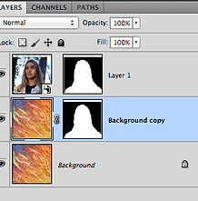
To start with I removed the background of the image I used of Alex, leaving me with just the profile of her head. I did this by using the quick selection tool, then selecting the area I wanted to keep. I selected 'select inverse' and added a layer mask, which masked the background. Following this, I downloaded an image of paint, with the colours associated to Hozier's debut album. I placed this layer underneath and made this a background and duplicated the layer. For the mask seen on the background copy layer to the left, I selected the quick selection on the 'layer 1' layer and pressed command to bring the selection of the portrait onto the background copy.
After this, I then transformed the copy by flipping it horizontally, so that the outline stood out against the original background.

After flipping the selection, I inverted the layer mask. This made the selection blue in contrast to the orange swirled background.

In addition, I followed the rules above again and created another image in the same style. However, I used a different image of my actress, to try and show more definition of the face against the textured background.
Despite this though, I found that although they complied to Hozier's style, they did not represent the music video in colour or relation - since there was no link to the song or fire.
Afterwards, I tried a similar concept, but changed the image/pattern of the background to a more colourful selection of paint strokes. I followed the same method as the previous Initial design to create these images.
The first however ended very similar to my previous design - the colours of the background and the portrait clashed together, creating a 'messy' outcome to envision - especially if text was to be added. Also, it once again did not illustrate the songs meaning or have any relationship to the visuals, or lyrics in the song or music video. Despite this though, the overall design does justify the 'Indie Genre', as it is unique in its appearance.

As part of the image above, I deleted the green/yellow background to reveal just the colourful portrait of hues of pink, blue, yellow and orange. This portrait by itself creates an aesthetic and appealing design, as the colours compliment each other and stand out to the public eye. The side profile also reveals Alex's face. However the image used for the past 3 designs, despite being a recognisable side profile, the hair connecting to the body made an out of proportion image. Also, as before, the design does not incorporate Hozier's song or music video, as there is no reference to flames, anger, loneliness etc.


Following the feedback received, I decide to start experimenting with photographic images, which would reflect the narrative of the Arsonist's Lullabye music video. For example, since the running trait of the video consists of fire, I decided to incorporate this into the visual graphics. Using the original image I took of my actress, I removed the background and refined the edges by smoothening the outline of the selection and feathering. I then downloaded a high resolution image of fire flames, which would be overlaid in Photoshop. Placing the image of Alex and the fire into the same Photoshop document, I added another layer, which I painted to make the illusion of a black background - I also painted over the bottom of her shoulders to merge the
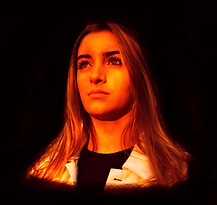

photograph into the background. Next, in order to achieve the orange/yellow, I added a gradient map in the adjustment layer. I changed the gradient to red blending into a vibrant yellow and set this layer to overlay. Additionally, I then lined up the flame image in accordance to the position of Alex's hair and added a black layer mask. To then make the flames visible in her hair, I used a white brush to feather brush in the flames to blend into the hair.
Overall, this creates a very effective digital design, since the vibrant gradient stands out against the black background and the flames remarkably blend in to the hair of my actress. The fire once again, reflects the narrative story of the music video as well, therefore conforming to the codes and conventions of the Digipak - giving an insight to the audience as they buy the EP of the single. However, the black background was not useful for the final design, as it limited my colour palette when adding the text.
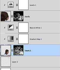
Keeping to the theme of fire and a photographic manipulation for the front cover designs of the Digipak, I decided to experiment a smoke effect on Photoshop. To start off with, I screen-shotted a film still
from the music video of Alex's side profile sat down. I removed the background of this by following the process of quick selection and refining, before flipping the image horizontally, so that she was facing right. I copied this layer to use as the liquify overlay. Before this though, I had to edit the side profile image black and white, using the gradient and black and white adjustment layers. The background layer also had to be edited to give a radius gradient of white to light grey. Once the images were positioned on the square canvas, I added a black layer mask to the original image of Alex, where I then selected a smoke brush in white and began placing smoke strokes coming out of her head. Once I had the beginning of the head, I then painted in the front of her face for it to blend into smoke. On the liquify layer, I liquified the hair and back of the head using the forward warp tool to increase the size of the hair and therefore the area to cover with smoke.


This was the first completed draft for the Digipak. To get the Hozier logo, I removed the background of a downloaded image leaving the white logo. I then increased the brightness and contrast of this to make it more visible. Furthermore, I then used a splatter paintbrush to recreate the splatter of paint around Hozier's logo. However, I decided that the colour palette of this was too plain in comparison to the previous orange flames design, which considerably stood out. Therefore I then changed the colour of the 'Arsonist's Lullabye' to orange to keep the fire theme flowing.
Following the same smoke pattern, I used the same brushes on the other sides of the Digipak to keep a running theme. The front and back covers had more black and white in ratio to orange, to reflect the image of the music video as that is edited in black and white. While, the inside pages of the digipak consist of more orange to give colour to the full final Digipak and link with the orange on the front and back.


To create the Magazine advert I just used the final image of my front cover of the digipak as the central image. I then used the same Hozier logo I edited as well. Also, I copied and pasted the RP studios logo I created for my production company Reverse Perception Studios, as well as the Island Records logo, which Hozier is signed to. I then added the Spotify and Apple Music logos after removing their backgrounds, as this reveals to the audience the platforms they can buy or stream 'Arsonist's Lullabye'. Following the conventions I researched of the magazine advert, I added a release date, large headings of the title of the album and the name of the artist, as well as a website link to promote.

bottom of page