top of page

QUESTION 1
IN WHAT WAYS DOES YOUR MEDIA PRODUCT USE, DEVELOP OR CHALLENGE FORMS AND CONVENTIONS OF REAL MEDIA PRODUCTS? //
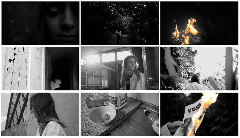


This is the contact sheet for my music video.
-
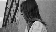
The first frame is an extreme close up, which introduces the character to the audience. This was done by a selection of different close ups to reveal the character as a cutaway from the dramatic running open sequence. By cutting this up, I was able to achieve suspense to keep the audience intrigued from the start.
-
The second frame is also from the opening. This conforms to the genre of drama and its codes and conventions, since it is a narrative point of view of the character running in the woods showing action codes through body language, the audience can see she is running from something, with the shots before they can identify she is anxious.
-
The 3rd frame is the reoccurring concept of fire, evident throughout the video. This infers to the audience that this is linked to her troubles. It also shows the special effects.
-
The 4th frame reveals the location and setting to the audience. This conforms to the codes and conventions of the indie genre for music video, it gives the video its own identity and style.
-
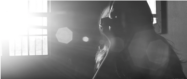
The 5th frame displays the cinematic camerawork used to represent the hybrid genre of indie music videos and narrative dramas. This is, however, a convention I used from the indie conventions to make the video artistic in style.
-
The next frame is a representation of the editing. By being black and white, it represents the artistic style indie genre films have. It also expresses the underlying dark themes of the message/narrative of the story visually in terms of the audiences interpretation to decode. Therefore, I have developed conventions here, as I have added in a concept to reflect the story/music beat not just for visual purposes. With my audience feedback, this was a success, as they stated that this black and white draws attention being dramatic. Also, since Hozier has previous music videos in black and white or narrative, I have used the conventions to follow his trademark, which is what Andrew Goodwin states for a successful video promotion.
-
Frame 8 incorporates the mise-en-scene and setting. These props were placed for the sole purpose of giving the impression to the audience that she is staying/taking refuge in the location previously explored in the song.
-
Lastly, this frame presents the visual special effects through detailed editing to the audience. The stark contrast between the colours of the flame and the black and white is inevitable for the audience to not notice the emphasis on the fire and its impact on the story. This links to Stuart Hall's reception theory of dominant-hegemonic position, where the preferred reading is understood and accepted.
USES:
I followed many of the conventions and forms of the Indie Genre for this music video, in order for it to conform to its style and target market in accordance to the song's genre.
-
"Narrative story" , as these have become more popular in recent years. Regarding audience research, over 70% of responses stated that they would prefer to watch a narrative story in the music video
-
"Largely revoked around cinematography" - this was used throughout the whole music video, using a variety of camera angles, movements and compositions, in order to reflect the genre of both indie and drama to the audience. By having this artistic style as well, it attracts the audience.


DEVELOP:
An aspect of the forms and conventions I developed was the editing process.
-
I followed the conventions of the indie genre in terms of slow motion editing. This also interlinked with the drama genre, in regards to creating tension and suspense to reflect the mood of the story.
-
I also made the visuals compliment the beat/pace of the song by cutting the shots to the sound bridges.
HOWEVER,
-
I developed the editing in regards to the drama genre, as I edited the video into black and white. By having the video in black and white, I could express the underlying dark themes of the narrative and lyrics of the song. This is an extension to the drama genre, which expresses an emotional journey - the black and white visually represents this.

CHALLENGES:
There is no convention that completely stands out against the typical conventions as such. Throughout the production process of my music video, I ensured that I took onboard the forms and conventions of the indie genre, as well as taking into account Andrew Goodwin's theory for a successful video, as this would then appeal to my target market and the genre.
HOWEVER,
-
Unlike Goodwin's theory and music video conventions, I did not have the artist featured in the music video - in performance or acting. However, the video still conforms to the codes of the indie genre to coincide with the song. Also, in audience research, respondents preferred to see a narrative story instead of a performance. Moreover, Hozier has a black and white narrative video for 'Take Me to Church', therefore a trademark can be established for his style. Moreover, I challenged Andrew Goodwin's theory, whilst still producing a successful video using codes and conventions of not only the indie genre, but also his theory in accordance to, for example, thought beats and narrative.
-
I also did not use this in my ancillary products either. This was to ensure that the trend of fire/black and white theme was visible for the audience to make a connection.
REAL MEDIA PRODUCT //
MY MEDIA PRODUCT //


An exemplar - displaying the forms and convention of real media products of the indie music video genre in comparison to 'Arsonist's Lullabye'. This clearly shows that the codes have been used in order to construct a similar concept to attract the target market, as these videos have millions of views - therefore are successful, despite their black and white theme. There are similarities in terms of camera shots, composition, cinematography and narrative.

USES:
-
"The front cover is a photographic or manipulated design" - I have used this convention to ensure that I follow the correct forms to attract my target audience in the indie genre. The manipulated design, using an image from the film shoot, is eye-catching and cooperates with the themes of the song and video.
-
"The back cover continues the artwork" - I have followed this form and convention to continue the themes of the video and the colour palette to create an authentic style. The Record label, Barcode, Tracklist and legal information have also been used.
DEVELOP:
-
I developed the forms and conventions of the manipulated design, as I fabricated the design much more creatively than the Digipak's I had previously analysed, such as "Imagine Dragons". However, I still conformed to the conventions of what needed to be included in the Digipak.
CHALLENGES:
-
One example of the Digipak challenging the forms and conventions expected, was creating a 4-panel Digipak. Despite there being many 4-panel packs, 6-panels are another design that is used. Therefore, I challenged the forms by creating a 4-panel Digipak, since the album is a small EP in response to the song "Arsonist's Lullabye".
-
Another challenge, was that I did not conform to Hozier's own album cover design, which consists of art collages. I did, however, experiment in that style with my own film stills to connect the main product with the ancillary products, although these were not successful. Therefore, I opted for the photographic approach whilst conforming to the conventions and forms of the Digipak and the indie genre.
USES:
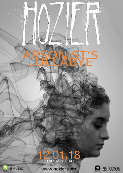
After analysing the forms and conventions, I ensured to use these within my final poster.
-
I made sure that the artist's name and the song/album title were larger than the rest of the text to stand out to the audience, the font is also clear in order to be legible. 'Hozier' is his logo/trademark, therefore this is larger for the audience to be aware of who the artist is - a common trait found in analysing adverts.
-
The central image is a manipulated design edited on Photoshop, similar to that of the indie genre posters I collected and analysed in research. Therefore, I have followed that convention by creating this smoke effect from her hair.
-
All the information is on there. Release date, labels, website and the logos of where it can be streamed, were added to stand out distinctly and allow the audience to understand when and how they can access it.
DEVELOP:
-
I once again developed the poster in regards to the creativity and visualisation of the poster, since it is highly manipulated. It is similar to the Kings of Leon poster I analysed, in the sense that the original Image has been morphed into something else, however, the extent of the manipulation on this 'Arsonist's Lullabye' advert is much more captivating.
CHALLENGE:
-
Although I did use the conventions for the information which should be on the poster, I did not add in reviews. I chose to not do this, as there was limited space on the poster for it to be added in without making it 'busy'. With audience feedback, they also preferred this method. There was little space due to the large size of the central and focal image and due to the grey and black colours of this, I had to carefully place the text in order for it to actually be legible over the image.
bottom of page